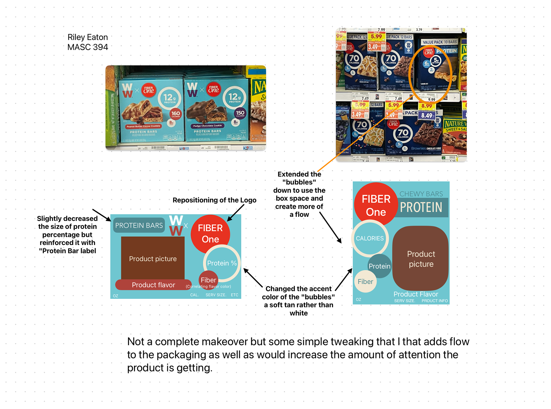
For this project, I was tasked with finding a product that could be easily overlooked in grocery stores because of its packaging, and creating a new look for the product that is more likely to attract the target audience's eye
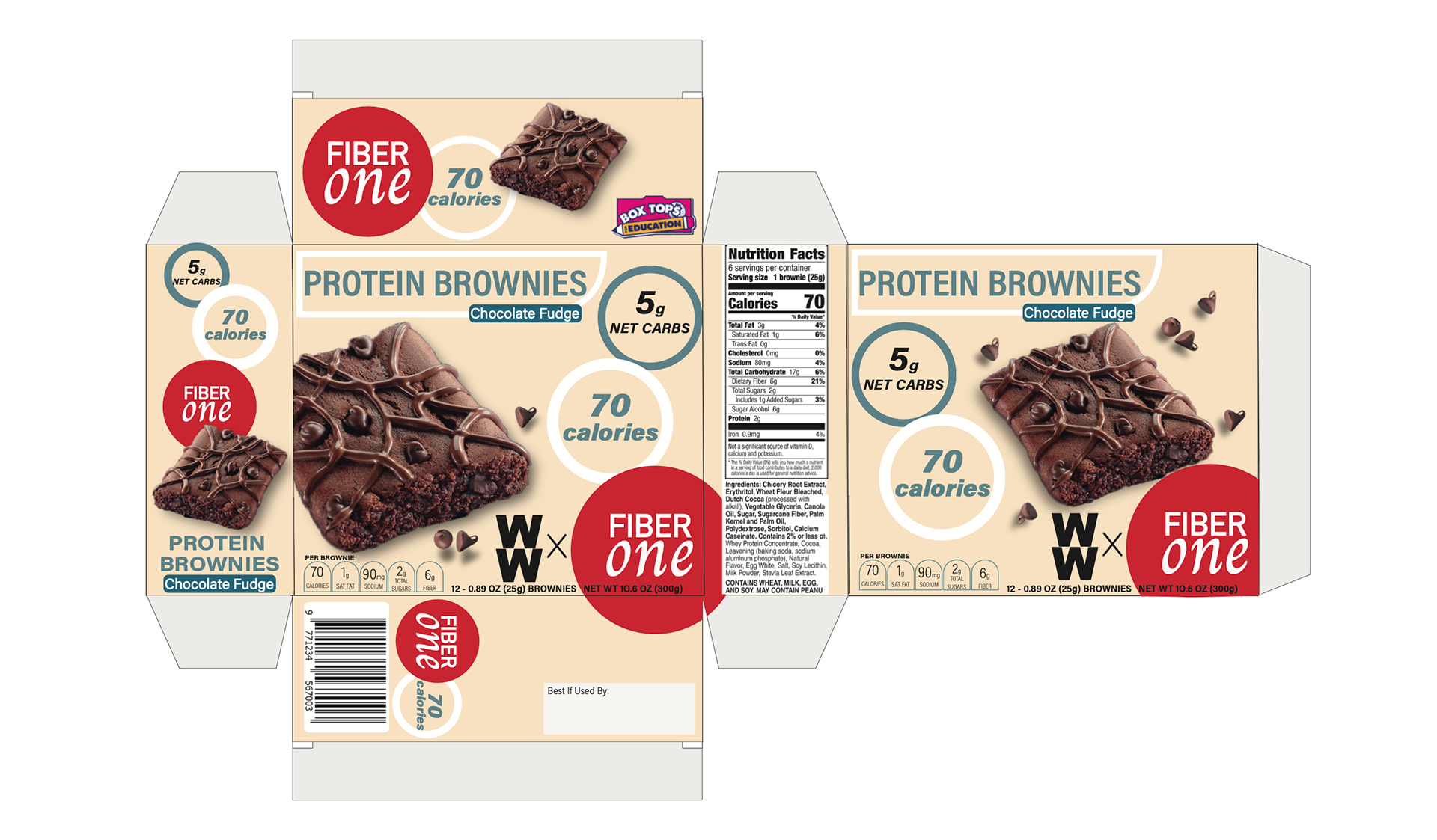
This is the packaging I made for FiberOne, but let me show you what we started with...
This is the packaging I found in the store. Dark colors, the product almost blending in with the background with a high contrasting white and red. Compared to similar products, which typically go for a colorful or natural tone these brownies easily faded into the background.

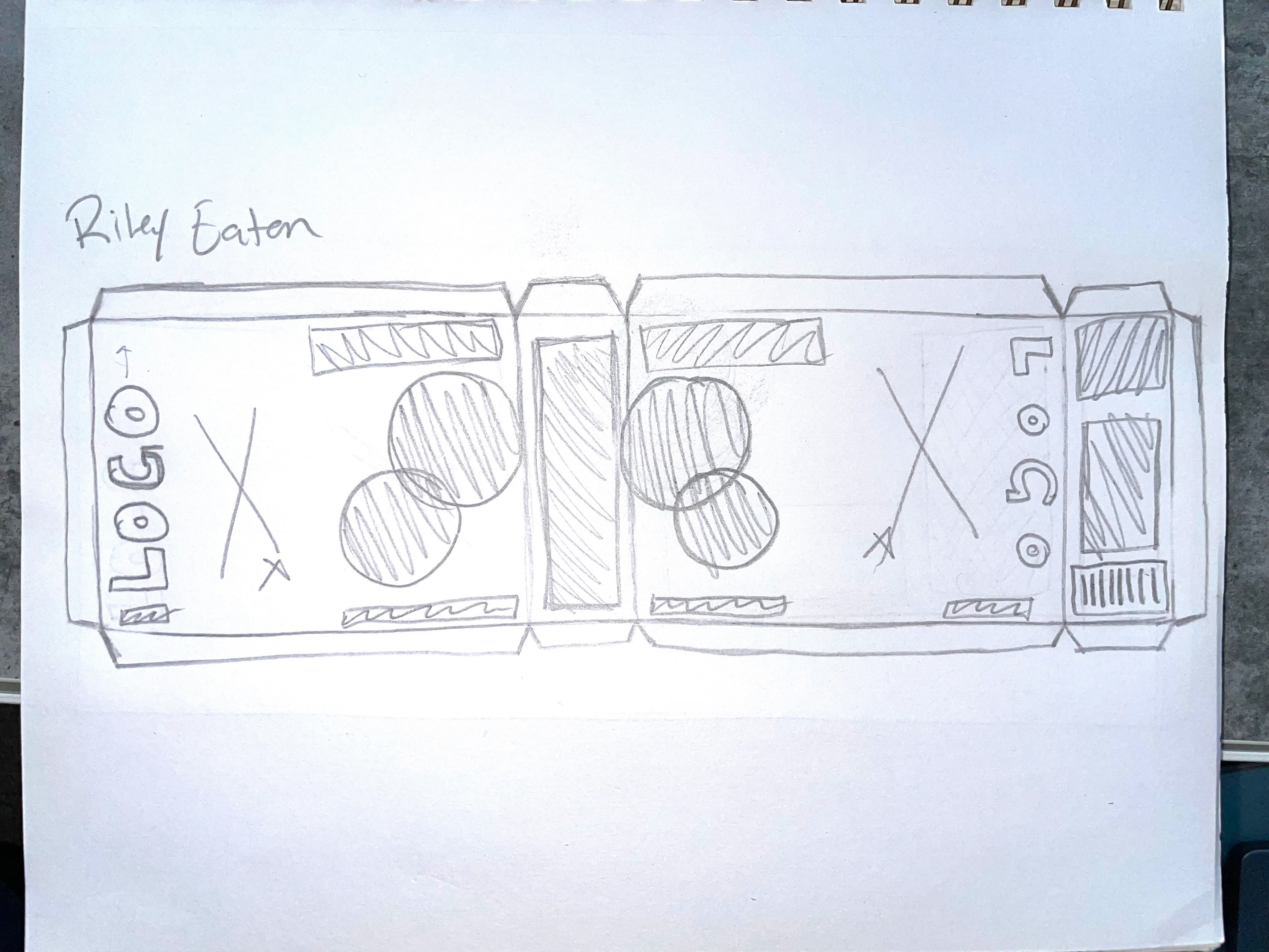
Here is a little bit of my drafting process. I worked to give these boxes a refresh while keeping the brand's cohesiveness intact.